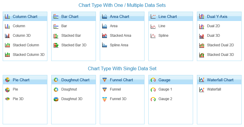
The Chart gallery lists the following chart types:
Chart Types
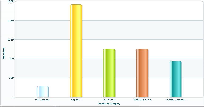
A Column chart uses a sequence of columns to compare values across categories.
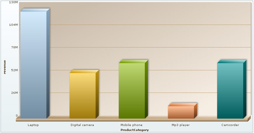
A Column 3D chart is similar to Column chart and shows a sequence of columns to compare values across categories in a 3D style.
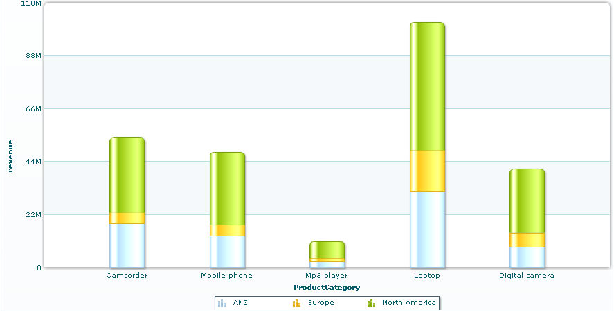
A Stacked Column chart represents multiple sets of data by one bar, or stack. Individual data elements are displayed as well as the cumulative whole for the sum of all data elements.
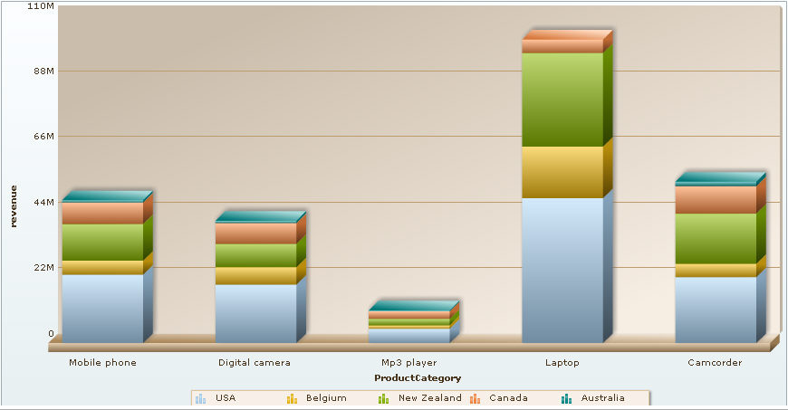
A Stacked Column 3D chart represents multiple sets of data by one bar, or stack in a 3D style. Individual data elements are displayed as well as the cumulative whole for the sum of all data elements.
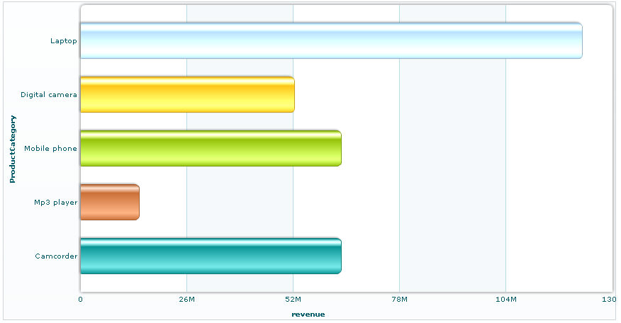
Most bar charts (also known as a column chart) display or compare several sets of data.
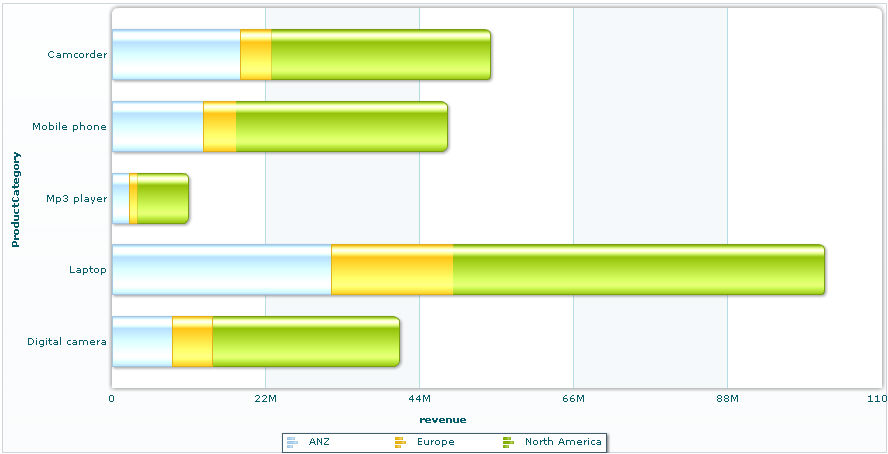
A Stacked bar chart displays data as a series by one bar, or stack. This type of chart is best suited for representing three series of data, each series represented by a color stacked in a single bar.
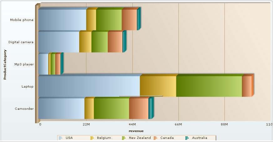
A Stacked bar chart displays data as a series by one bar, or stack in a 3D style.
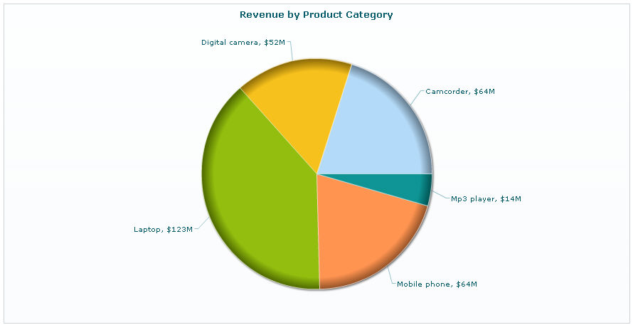
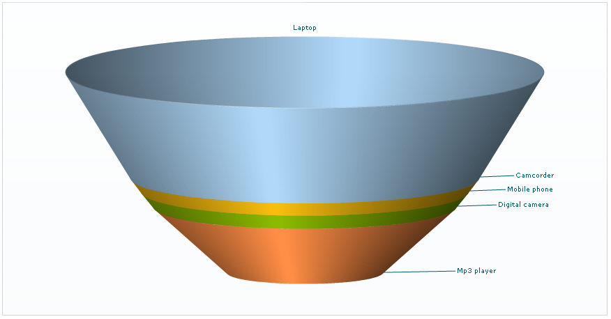
A pie chart displays data as a pie, split and filled with color or patterns. Pie charts are typically used for one group of data.
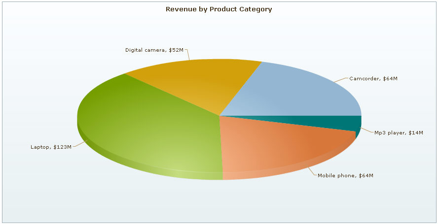
A Pie 3D chart is similar to pie chart and displays data as a 3D pie, split and filled with color or patterns. Pie charts are typically used for one group of data.
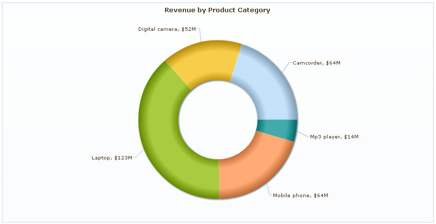
A doughnut chart is similar to a pie chart, displaying data as sections of a circle or doughnut.
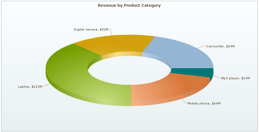
A doughnut 3D chart is similar to doughnut chart and displays data as sections of a circle or doughnut in a 3D style.
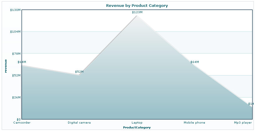
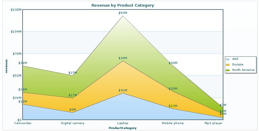
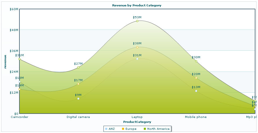
An area chart displays data as areas filled with color or patterns.
A stacked area chart is simply an area chart that uses two or more data series.
A Spline Area chart is simply an area chart that plots a fitted curve through each data point in a series.
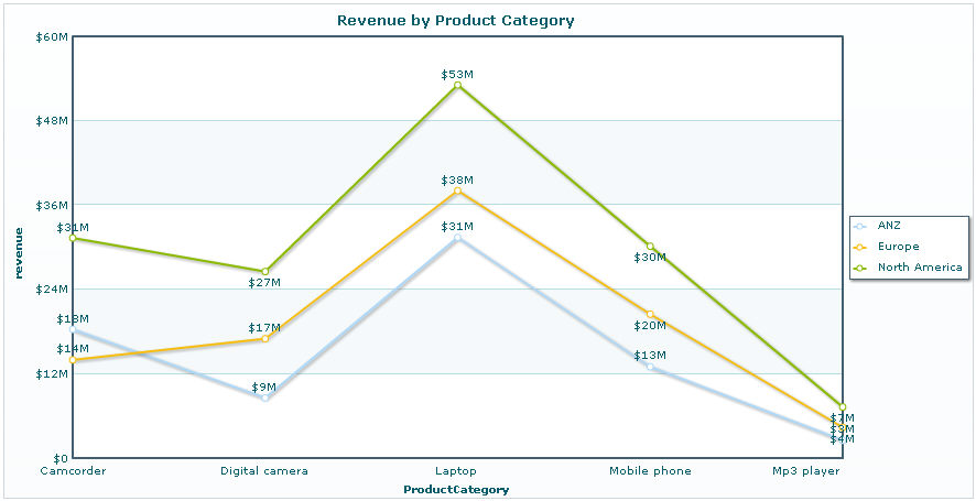
A line chart displays data as a series of points connected by a line.
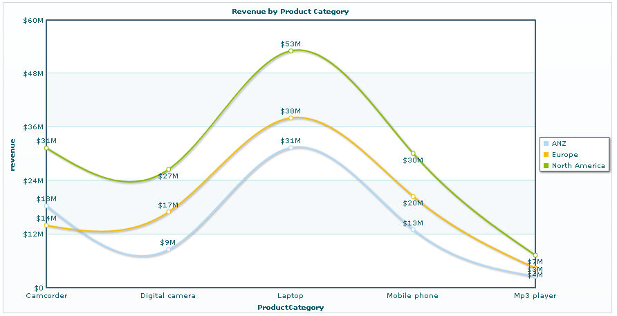
A Spline chart is simply a line chart that plots a fitted curve through each data point in a series.
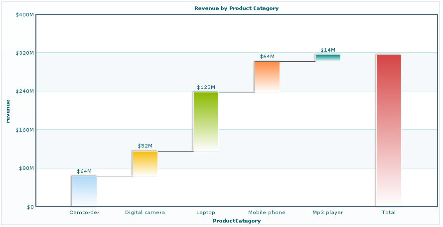
A waterfall charts lets you show how a value increases or decreases to come to a final value.
Funnel chart is used to show progressive reduction of data as it passes from one phase to another and is often used to represent stages in a sales process. For example, the amount of potential revenue shown for each stage. This type of chart can also be useful in identifying potential problem areas in an organization's sales processes.
Funnel 3D is similar to Funnel chart and shows progressive reduction of data as it passes from one phase to another in 3D style.
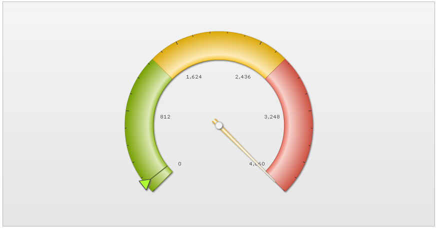
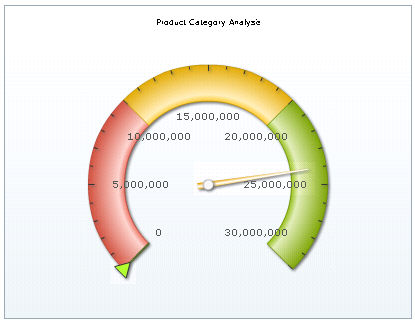
A gauge chart presents values graphically as points on a gauge. Gauge charts, like pie charts, are typically used for one group of data.
This gauge 1 chart presents values graphically as points on a gauge with background color filled in green, yellow and red sequence.
This gauge 2 chart is similar to gauge 1 except for the background color defined in red, yellow and green sequence to highlight areas of the gauge.
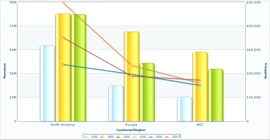
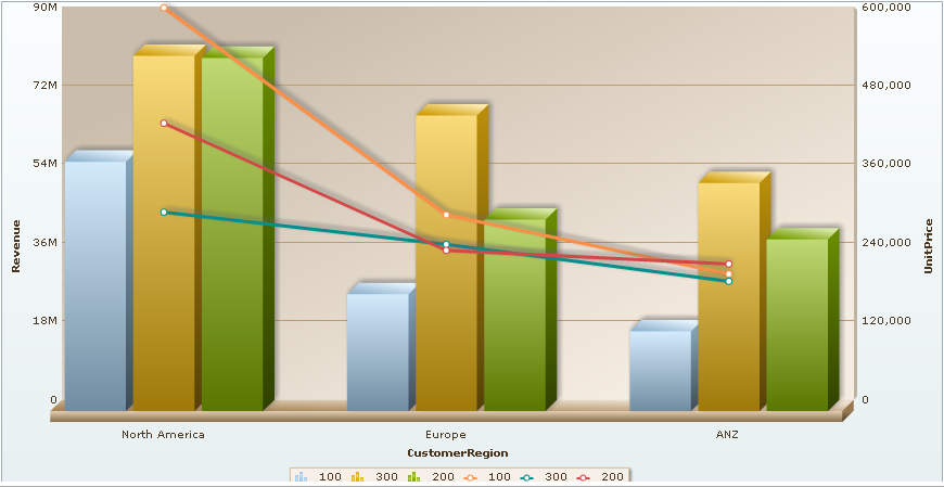
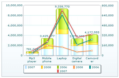
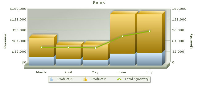
A Dual Y Axis chart is a chart that combines two or more charts types in a single charts e.g., a column charts series and a line charts series. In a dual Y axis combination charts, each axis has its own unit and magnitude, and each data series conforms to one of these axis.
A Dual 2D is similar to Dual Y Axis chart and displays by combining two or more charts types in a single charts e.g., a column charts series and a line charts series in a 2D style.
A Dual 3D is similar to Dual Y Axis chart and displays by combining two or more charts types in a single charts e.g., a column charts series and a line charts series in a 3D style.
A Stacked Dual 2D chart is similar to Dual Y Axis chart and displays by combining two or more charts types in a single charts by one bar, or stack in a 2D style.
A Stacked Dual 3D chart is similar to Dual Y Axis chart and displays by combining two or more charts types in a single charts by one bar, or stack in a 3D style.