![]()
A waterfall chart is a form of data visualization that helps in determining the cumulative effect of sequentially introduced positive or negative values.
In the Chart Design page, place the metric you wish to study in the Y-axis field and in the X axis field, specify the column on the basis of which you wish to categorise the Y-axis data.
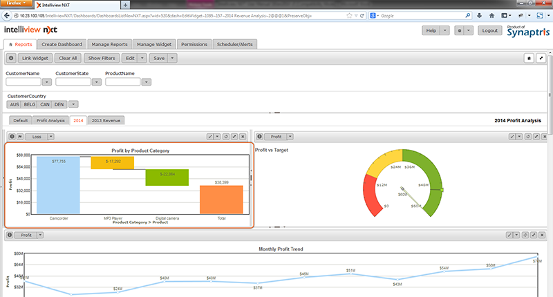
In the example illustration below, Sales Margin (Profit) from product categories and their contribution to the total revenue is demonstrated. In this chart, effects of unprofitable products i.e negative values are also illustrated.
‘Sales Margin’ is on the Y axis and ‘Product Category’ has been specified on the X-Axis.
![]()
<<Gauge Charts | Chart Types - One/Multiple Data Set>>