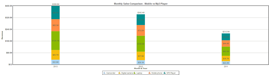
Stacked bar graph is a graph that shows the contribution of different categories to the whole. In a stacked bar chart more than one data series is plotted. The image below shows a stacked bar chart. While sales revenue per year is plotted along the Y-axis, each segment of the bar shows quantum of sales achieved from each product category. This type of chart would not be suitable for cases with any negative quantum of data.
Fig. Within the bars showing total sales, the distribution of sales achieved through different methods is visible in this stacked bar chart.
![]()
<<Column and Bar Charts | 3-D Bar Charts>>