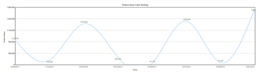
A spline chart or spline graph displays information as a series of data points connected by a fitted curve. The curve is obtained by using a limited number of data points and extrapolating for the intervening values. In some situations such curve-fitting is necessary to more accurately study the trend in data.
In the example illustration below, value of orders from customer ‘Colin Kinsley’ are plotted against time.
Fig.Spline chart.
![]()
<<Line Charts | Area Charts>>