The editing/design of a Table widget is illustrated in steps with an example.
Let us consider the example where the ‘PinnacleTransactions’ data model is used to create a Table widget. In the first instance of the design page, all the rows and tables available in the data model are displayed on the design page very similar in presentation to a spreadsheet that has multiple columns and rows.
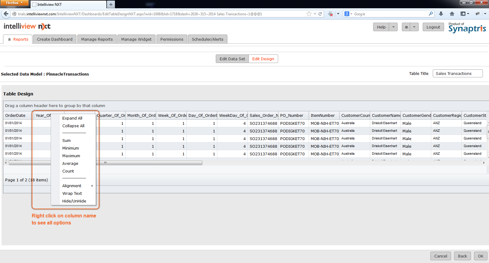
From this overall view of the data model choose which columns you wish to specifically display in the Table widget of your report. To do so, right click on a column. You will be provided with a list of options – one of the options is to hide/unhide the column. De-Select all the columns that you do not want displayed in the Table. Once you hit OK, you will only see the columns selected by you in the Hide/Unhide menu.
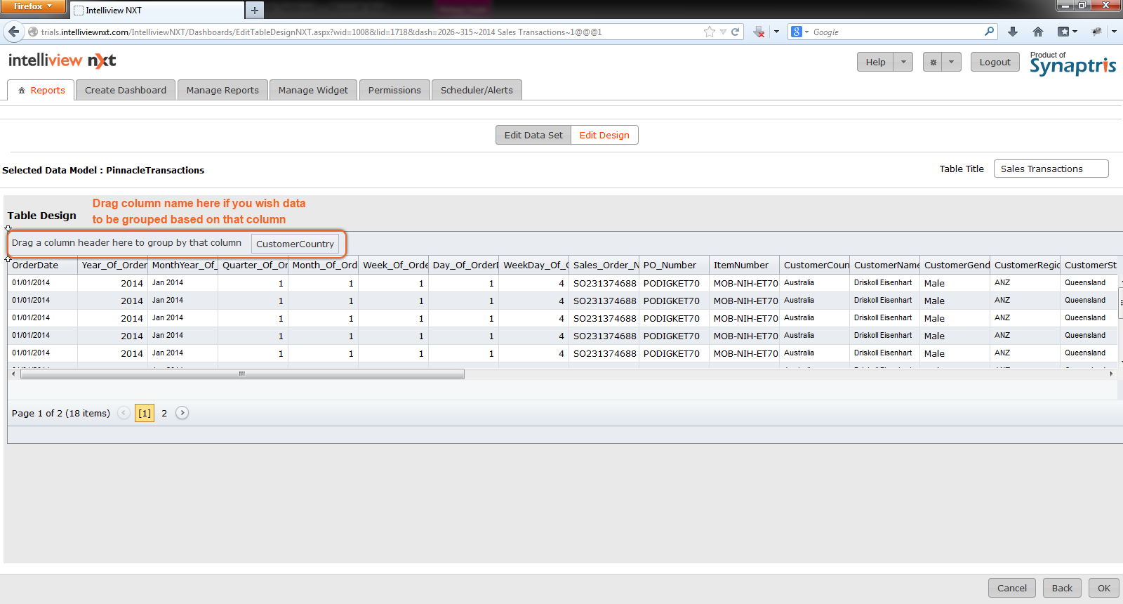
Once you have chosen which columns you wish to display in your report, you may choose to group your data based on column values. By right clicking on a specific column, you can also apply summary functions on your data. If the column contains numeric data, you will have the choice to compute the Sum, Minimum, Maximum, Average and Count.
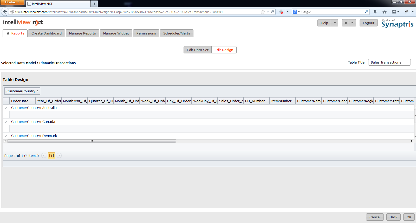
For example in the image below, data in the table above is grouped into ‘Customer Country’ and the ‘Revenue’ is summed per country as illustrated in next image.
Right clicking on any of the columns in the Table displays the list of operations possible on the field.
![]()