In the ‘Set Exceptions’ page, you have the opportunity to edit/customize the appearance of your chart based on your particular business need. Setting up exceptions allows you to highlight portions of your chart for greater visual impact. Using exceptions, you may –
Use a grey scheme instead of the color scheme selected in the ‘Chart Properties’ page.
If your organisation has specific color codes for internal or external reporting, on this page you can implement the codes by assigning particular colors to column values such as Red for “Canada”, Orange for “Netherlands” etc.
Set up business exceptions that highlight portions of the report when certain conditions are met. You could for instance highlight specific Products that did not meet the minimum revenue threshold of $1 Million in 2013 to display in Red enabling the user to identify under-performing products with a quick glance.
Define one or more trend lines to monitor current metrics against pre-defined trends. You could for instance define a minimum revenue target you expect to achieve and an optimum revenue target you would like to achieve as two separate trend lines to easily enable the user to identify current revenue level vs minimum level and optimum level. Trend lines are supported only for the chart types that support One/Multiple Datasets such as the chart types under Column, Bar, Area, Line and Dual Y.
Let’s look in more detail at the different types of exceptions you can set up using Intelliview NXT.
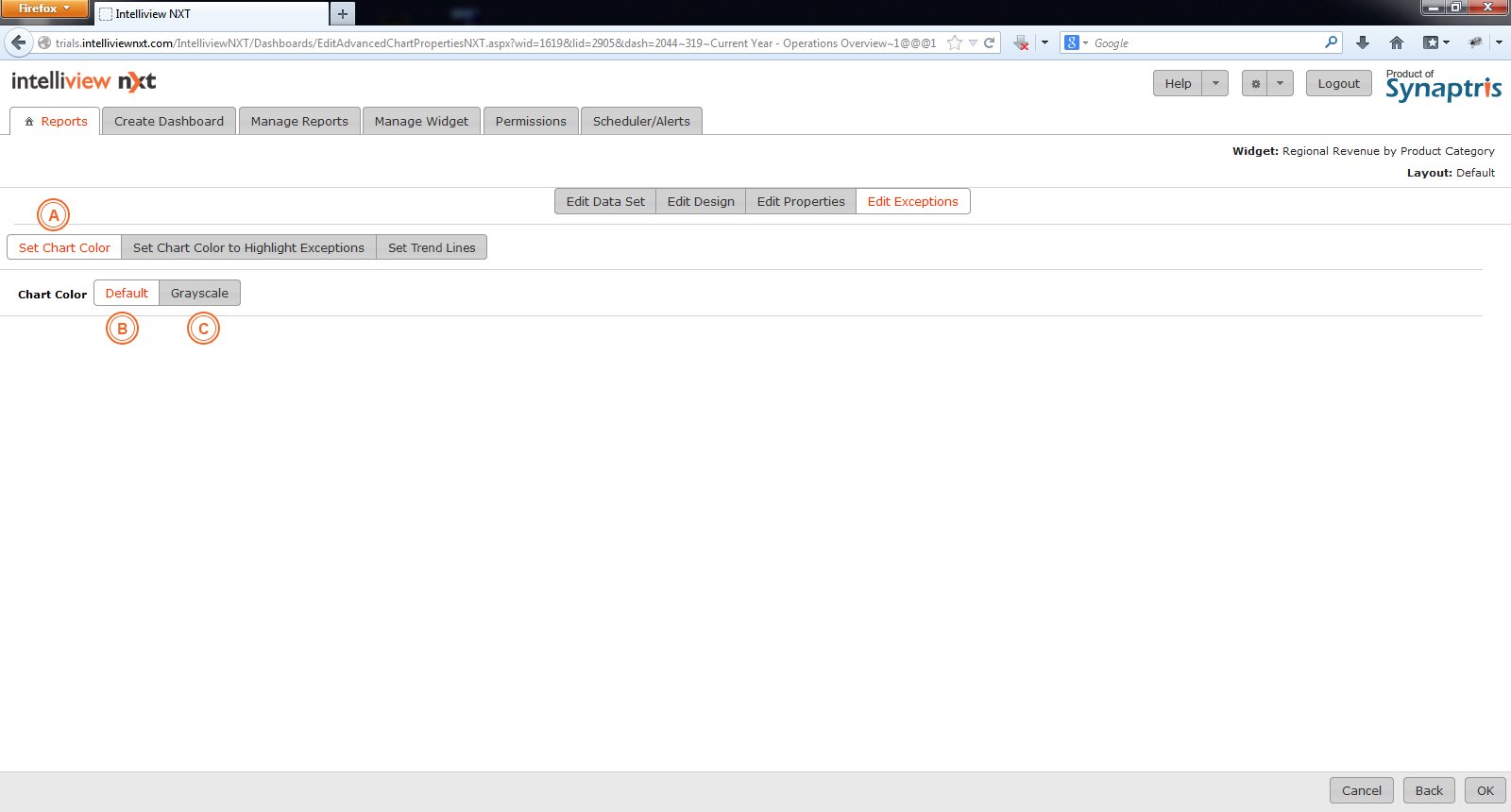
Under ‘Set Exceptions’, in the first instance, you have the option to select to have the chart to appear in grayscale instead of the default color scheme set for the system or for a particular chart.
|
A |
Choose this option to select the default color theme as defined in the Chart properties page (OR) to choose to display the chart colors on the greyscale instead of using the color scheme defined in the Chart Properties page. |
|
B |
The default color scheme applies the color scheme selected in the chart properties page. |
|
C |
This option will convert your chart image to grey-scale. |
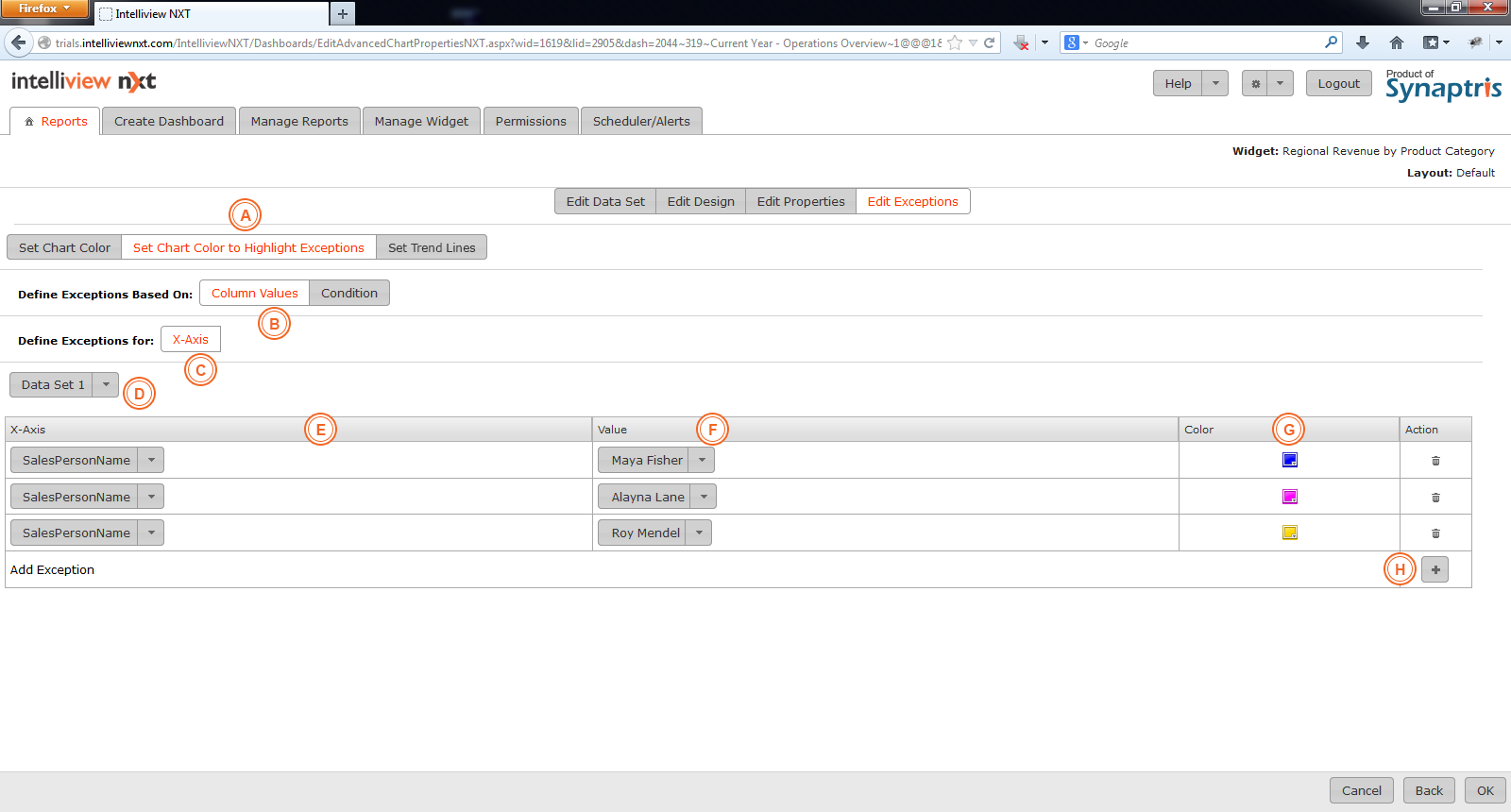
Next we look at “Set Chart Color to Highlight Exceptions”. Under this option there are two possibilities to pick from. In the screen shown below, “Column Values” is chosen. You can assign unique colors to each unique value of the selected column that is used in the X axis or in the Series column.
|
A |
Set Chart colors to highlight Exceptions. |
|
B |
Choose this option to assign colors based on column values. |
|
C |
Colors can be assigned to the value of any selected column in either the X-axis or the Column used as Series (the option to select Series will be available only if a column has been used in the Series area in the chart design. This option is not available for “Chart types with single dataset” as they do not support a Series column). |
|
D |
Choose the relevant data-set from the dropdown list. |
|
E |
Pick the column name the values for which you wish to assign colors to. |
|
F |
Pick the column value you wish to assign colors to. |
|
G |
Clicking this button will open the color wheel. You can select your desired color or enter the Hex code value for the color you want to pick. |
|
H |
If you wish to add more conditions, you may do so by clicking on the + sign. |
|
I |
|
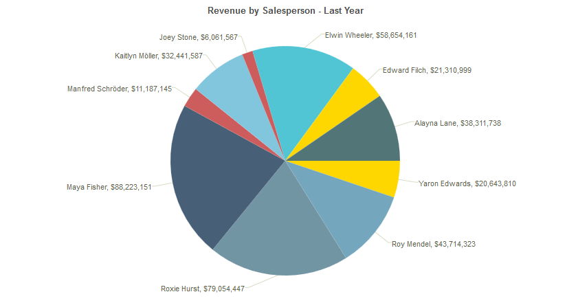
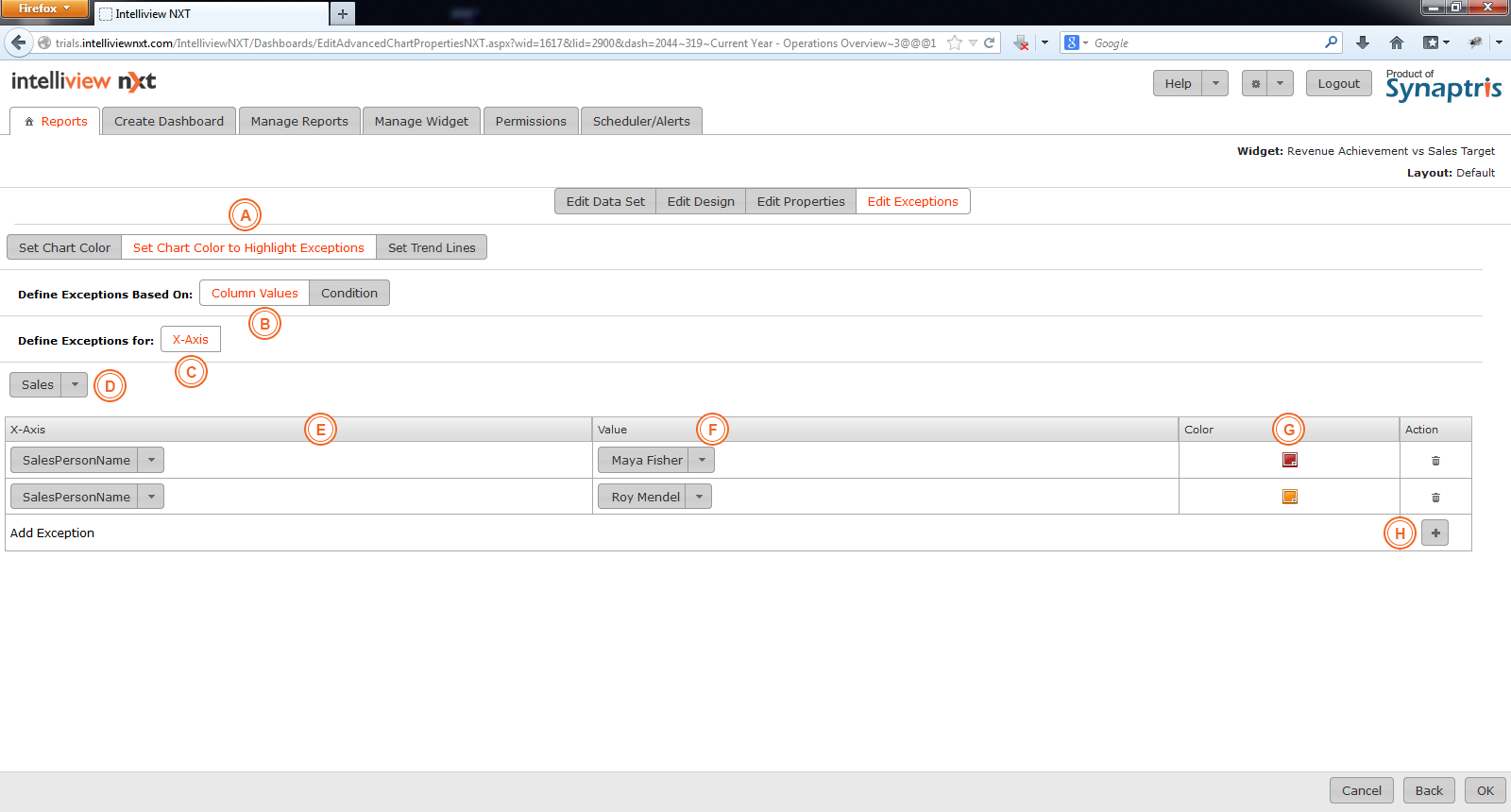
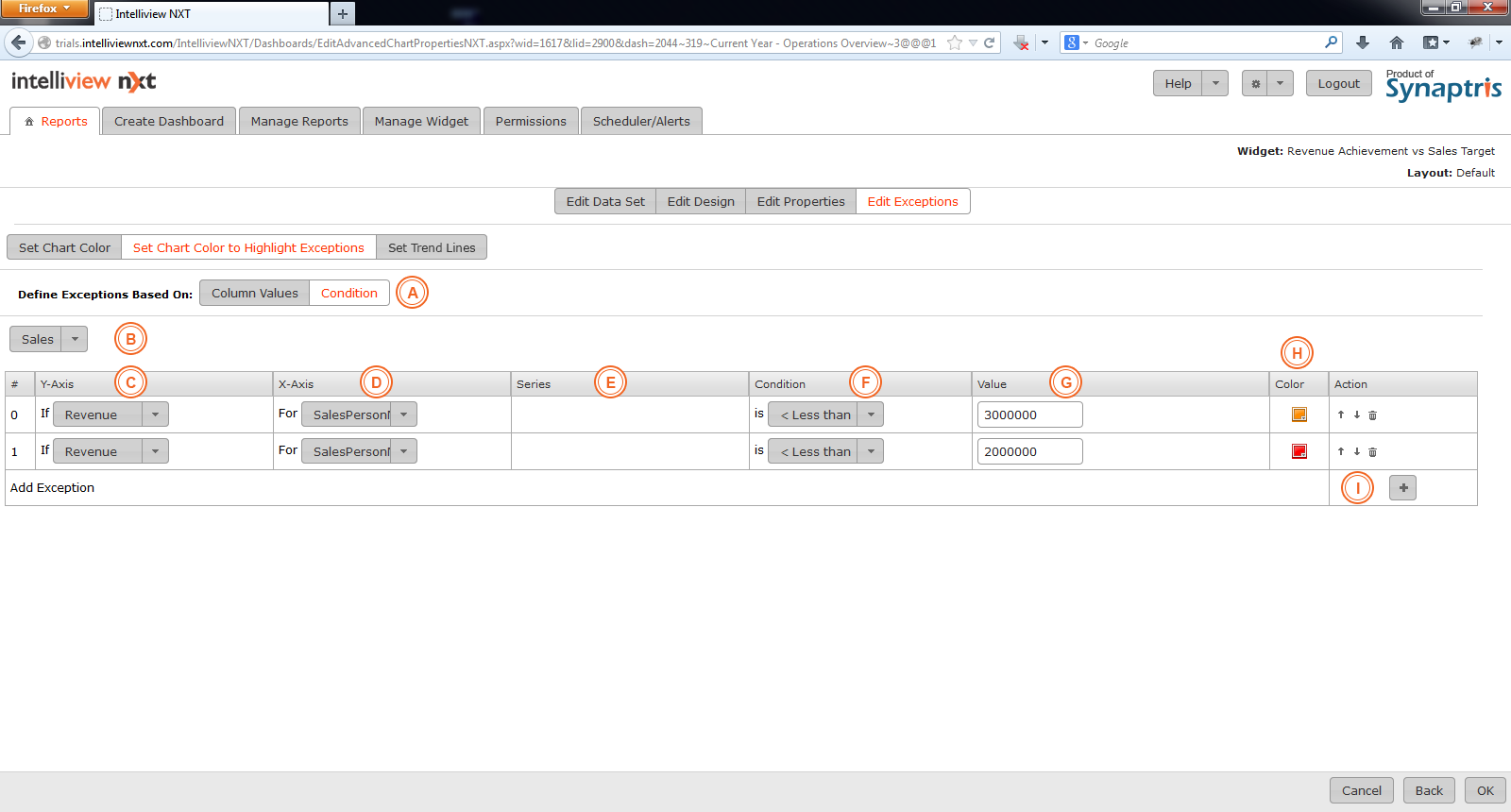
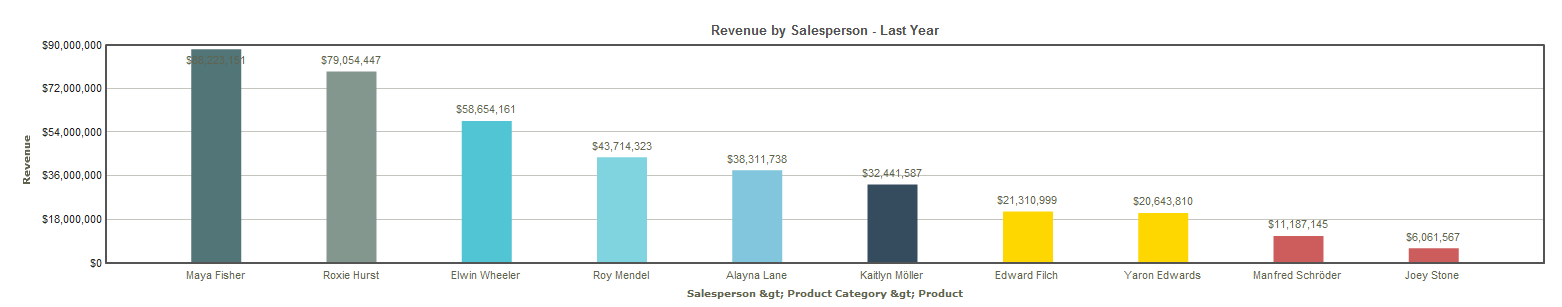
You can also have particular color schemes come into effect when certain criteria are met in the data. For instance, if you were designing a chart plotting revenue by salesperson for last year, and wished to highlight salespersons that had underperformed against the average revenue target, you would choose Revenue in Y axis and Salesperson in X axis as shown below. Then you would set the number condition for the Revenue field that would trigger the exception leading to that portion of the chart being a particular color. You could also setup more than 1 condition as shown below (Revenue achievement below $20M in Red and Revenue achievement between $20 and $30M in Yellow.

|
A |
Pick ‘Conditions’ from the available two options if you want parts of your chart highlighted when the data satisfies certain criteria. |
|
B |
Choose the required dataset. |
|
C |
Select the Y axis column for which you want to define the exception condition. |
|
D |
From this list, pick the specific X Axis you want to associate with the exception or if the condition is independent of the X-axis column, pick “All Columns”. |
|
E |
The series drop down will not populate with values and will only provide the “All Values” option as “Chart types with single dataset” do not support a Series column. |
|
F & G |
Set the condition that aggregated data values for the Y axis column must satisfy for the colour scheme to be set in effect. |
|
H |
Choose the required color from the color wheel. |
|
I |
If you wish to add more conditions, you may do so by clicking on the + sign. |
|
J |
|
Exceptions are processed in a top to bottom sequence. If there is an overlap in conditions, the last condition in the list overrides the first condition in the list.
If you wish to disable exceptions under ‘Set Chart Color’ section, select ‘Default’or‘Grey Scale’.
The exception conditions defined in the Set Exceptions page can be used to setup Alert Monitoring under the Scheduler/Alerts menu. We will review this in more detail in the section titled ‘Schedule for Alert Monitoring’.
In the ‘Set Exceptions’ page, you have the opportunity to edit/customize the appearance of your chart based on your particular business need. Setting up exceptions allows you to highlight portions of your chart for greater visual impact. Using exceptions, you may –
Use a grey scheme instead of the color scheme selected in the ‘Chart Properties’ page.
If your organisation has specific color codes for internal or external reporting, on this page you can implement the codes by assigning particular colors to column values such as Red for “Canada”, Orange for “Netherlands” etc.
Set up business exceptions that highlight portions of the report when certain conditions are met. You could for instance highlight specific Products that did not meet the minimum revenue threshold of $1 Million in 2013 to display in Red enabling the user to identify underperforming products with a quick glance.
Define one or more trend lines to monitor current metrics against pre-defined trends. You could for instance define a minimum revenue target you expect to achieve and an optimum revenue target you would like to achieve as two separate trend lines to easily enable the user to identify current revenue level vs minimum level and optimum level. Trend lines are supported only for the chart types that support One/Multiple Datasets such as the chart types under Column, Bar, Area, Line and Dual Y.
Let’s look in more detail at the different types of exceptions you can set up using Intelliview NXT.
Under ‘Set Exceptions’, in the first instance, you have the option to select to have the chart to appear in grayscale instead of the default color scheme set for the system or for a particular chart.

|
A |
Choose this option to select the default color theme as defined in the Chart properties page (OR) to select to display the chart colors on the greyscale instead of using the color scheme defined in the Chart Properties page. |
|
B |
The default color scheme applies the color scheme selected in the chart properties page. |
|
C |
This option will convert your image to gray-scale. |
|
A |
Set Chart colors to highlight Exceptions. |
|
B |
Choose this option to assign colors based on column values. |
|
C |
Colors can be assigned to the value of any selected column in either the X-axis or the Column used as Series (the option to select Series will be available only if a column has been used in the Series area in the chart design). |
|
D |
If you are using more than 1 dataset, choose the relevant data-set from the dropdown list. |
|
E |
Pick the column name the values for which you wish to assign colors to. |
|
F |
Pick the column value you wish to assign colors to. |
|
G |
Clicking this button will open the color wheel. You can select your desired color or enter the Hex code value for the color you want to pick. |
|
H |
If you wish to add more conditions, you may do so by clicking on the + sign. |
You can also have particular color schemes come into effect when certain criteria are met in the data. For instance, if you were designing a chart plotting revenue by salesperson for last year, and wished to highlight salespersons that had underperformed against the average revenue target, you would choose Revenue in Y axis and Salesperson in X axis as shown below. Then you would set the number condition for the Revenue field that would trigger the exception leading to that portion of the chart being a particular color. You could setup more than 1 condition as shown below (Revenue achievement below $20M in Red and Revenue achievement between $20 and $30M in Yellow.
|
A |
Pick ‘Conditions’ from the available two options if you want parts of your chart highlighted when the data satisfies certain criteria. |
|
B |
Choose the required dataset. |
|
C |
Select the Y axis column for which you want to define the exception condition. |
|
D |
From this list, pick the specific X Axis you want to associate with the exception or if the condition is independent of the X-axis column, pick “All Columns”. |
|
E |
The series drop down will not populate with values and will only provide the “All Values” option as “Chart types with single dataset” do not support a Series column. |
|
F |
Pick the column value you wish to assign colors to. |
|
F & G |
Set the condition that aggregated data values for the Y axis column must satisfy for the colour scheme to be set in effect. |
|
H |
Choose the required color from the color wheel. |
|
I |
If you wish to add more conditions, you may do so by clicking on the + sign. |
Exceptions are processed in a top to bottom sequence. If there is an overlap in conditions, the last condition in the list overrides the first condition in the list. If you wish to disable exceptions under ‘Set Chart Color’ section, select ‘Default’ or ‘Grey Scale’.
The exception conditions defined in the Set Exceptions page can be used to setup Alert Monitoring under the Scheduler/Alerts menu. We will review this in more detail in the section titled ‘Schedule for Alert Monitoring’.
Using the Set Trend Lines option, you can define one or more trend lines against which you can compare the metrics that are being displayed in the Chart. Trend lines are supported only for the chart types that support One/Multiple Datasets such as the chart types under Column, Bar, Area, Line and Dual Y.
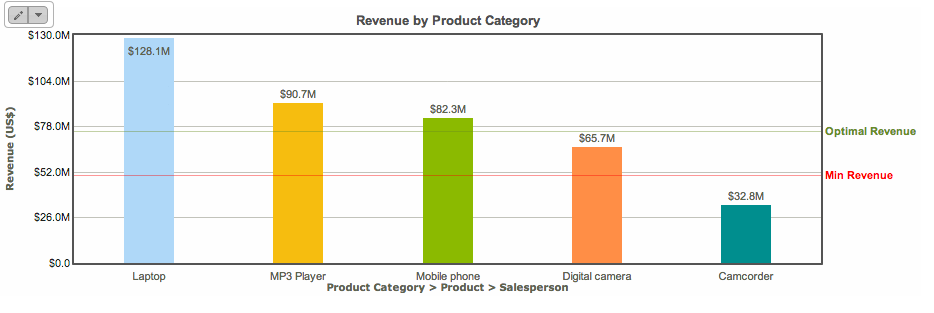
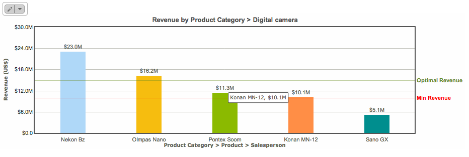
For instance, if you were designing a chart plotting revenue by Product Category for last year, and wished to define a trend line for Minimum Revenue expected by Product Category as well as Optimal Revenue for Product Category, you would choose Revenue in Y axis and Product Category in X axis as shown below. Then you would set the Revenue value where you want the Trend Line drawn for Minimum Revenue and the Revenue Value where you want the Trend Line drawn for Optimal Revenue.
You could also setup different Trend lines at the Drill Down level. In this case, when you drill down from Product category to Product, the Trend Lines for Minimum and Optimal Revenue for the Product will be displayed at Revenue levels different from the ones defined for the Product Category.
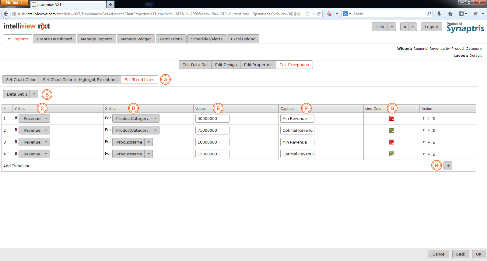
|
A |
Select ‘Set Trend Lines’ to enable setting Trend Line value(s). |
|
B |
Choose the required dataset. |
|
C |
Select the Y axis column for which you want to define the Trend Line. |
|
D |
From this list, pick the specific X Axis you want to associate with the Trend Line or if the Trend Line is independent of the X-axis column, pick “All Columns”. |
|
E |
Set the value for the aggregated data value for the Y axis column where you want the Trend Line drawn. |
|
F |
Define the Caption you want display for the Trend Line. |
|
G |
Choose the required color from the color wheel. |
|
H |
If you wish to add more Trend Lines, you may do so by clicking on the + sign. |
The images below illustrate the effect of setting the Trend Lines at the Product Category Level and at the Drill down Product level.
![]()
<< Edit Properties of Chart | Edit Data Set of Pivot >>