As mentioned earlier, Editors can completely alter the widget – even the metrics used for the Y-axis and the X-axis and the computations applied to them can be changed. Only the datamodel cannot be changed.
Widgets are classified into Chart, Table and Pivot. Under Chart type there are ‘Single Data Set Charts’ (for designing pie, donut, funnel, gauge and waterfall type charts) and there are ‘One/Multiple Data Set Charts’ (for designing column, bar, line, area and dual y-axis types of chart). Editors can switch between different chart views for the data - for instance a pie-type widget can be modified to be a Line/Column chart type widget and vice versa.
The ‘edit design’ page of ‘Single Data Set Charts’ and that of the ‘One/Multiple Data Set Charts’ have some slight differences. With ‘One/Multiple Data Set Charts’ you have the additional option of superimposing data series one over another. So we will look at the ‘edit design’ pages of the two kinds of charts separately. If you are unsure which type of chart you are working with, please refer to the design pages illustrated for both types in the next section.
The edit design screen of a ‘Single Data Set Chart’ looks like the illustration below. The edit/ design page is same for all single dataset chart widgets with the exception of the Gauge widget. Further on, the design page for gauge widgets is explained in detail. If you wish to change the type of chart, to assist you in selecting the type of chart most suitable for your needs, the different types of charts are explained in the reference section under “Chart Types – Single Data Set”.
|
A |
List of columns available in the data model. |
|
B |
Drag the column name of the business metric you wish to study in your chart to this field. |
|
C |
Choose from the summary function in the drop down list - the choices are Sum, Average, Max, Min, Count and Count Distinct. |
|
D |
These tabs are ‘sub-reports.’ |
|
E |
If you wish to apply any computation to the Y axis columns, make the selection from this drop down list here. |
|
F |
If you wish to sort the values in the Y-Axis, drop this down to select Ascending or Descending. |
|
G |
If you wish to represent only the top few of the highest or lowest numbers (depending on whether you are sorting the data descending or ascending) being plotted along the Y-axis, you may specify how many of the Top N numbers you wish to use here. For example, entering 4 here when the sort order is Descending (with Revenue in Y and Product in X axis) will only display the top 4 products (by Revenue) in the chart. |
|
H |
In the X axis, specify the column(s) that you want to use to aggregate the Y axis value. You can choose up to six columns for the X-axis which will define the drill down path in the order you drop/add the columns. |
|
I |
To sort the values in the column for the X-axis, go here |
If you are editing/designing a Gauge chart, the design steps for the Gauge Chart is explained in the Reference section under “Design Gauge Chart”.
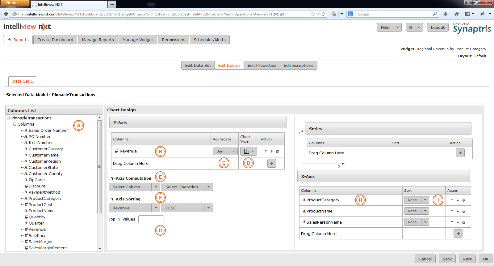
Below is the illustration and explanation of edit design screen of ‘One/Multiple Data Set Chart’. Editors may change any or all of the fields in the design page.
|
A |
Pick the data set you wish to work with. |
|
B |
Columns in the dataset will be listed here. You may select the columns you wish to use for the chart you are designing and drag and drop them into the appropriate boxes. |
|
C |
Drag the column name of the business metric you wish to plot in your chart onto this field. You may also select the required column from the list available under the +. |
|
D |
Choose from the summary function in the drop down list - the choices are Sum, Average, Max, Min, Count and Count Distinct. |
|
E |
Select Chart Type from this drop down list. |
|
F |
If you wish to apply any computation to the Y axis columns, make the selection from this drop down list here. |
|
G |
If you wish to sort the values in the Y-Axis, drop this down to select Ascending or Descending. |
|
H |
If you wish to represent only the top few of the highest or lowest numbers (depending on whether you are sorting the data descending or ascending) being plotted along the Y-axis, you may specify how many of the Top N numbers you wish to use here. For example, entering 4 here when the sort order is Descending (with Revenue in Y and Product in X axis) will only display the top 4 products (by Revenue) in the chart. |
|
I |
In the X axis, specify the column(s)that you want to use to aggregate the Y axis value. You can choose up to six columns for the X-axis which will define the drill down path in the order you drop/add the columns. |
|
J |
If you wish to use a series column, this is the area to drop/add the series column. |
|
K |
When working with multiple datasets, pick the relevant data set from herein order to super impose the chart design for the additional data set. A fresh design screen for the next series will appear where the columns can be placed in relevant fields in same manner as for the first dataset. |
![]()
<< Edit Data Set of Chart | Edit Properties of Chart >>