Single series charts support one Y Axis column and one primary X Axis column. You can include additional X Axis columns to define drill down.
Multiple series charts support more than one Y-axis column. For more information on designing chart types with multiple data sets, refer Design (Chart Type with one/multiple data sets).
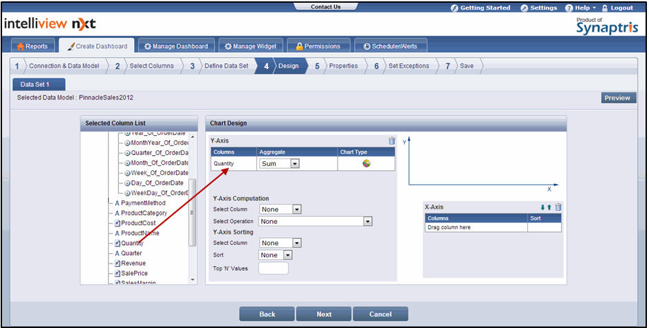
To design a chart:
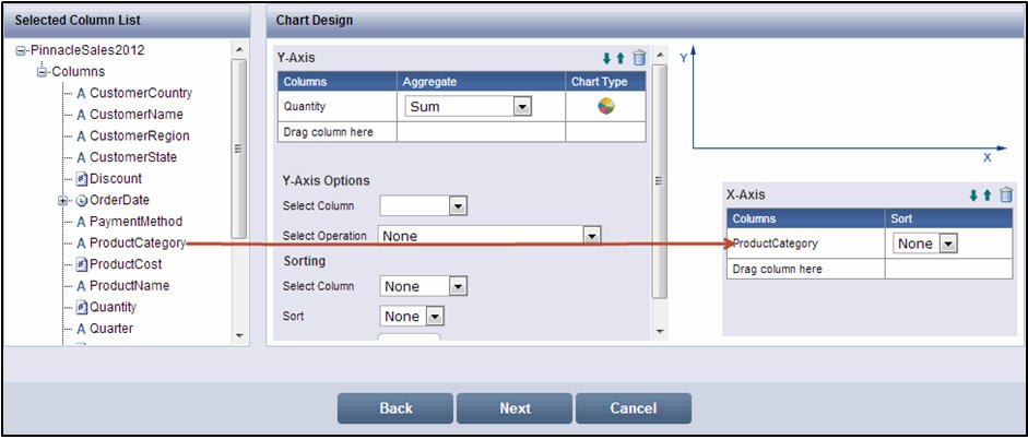
From the Selected Column List section, drag the required column to the Y-Axis subsection of the Chart Design section. You can add only one column as the Y-axis for single series chart types. For chart types with multiple data sets, you can add more than one column as the Y-axis column. For more information on designing chart types with multiple data sets, refer Design (Chart Type with one/multiple data sets).
Design screen
![]() Note:
Note:
You use the column that is of primary interest to you and the most representative of the business metric as the Y-axis. The chart visually illustrates the column that you select as the Y- axis. For example, if you want to design a widget that helps analyze product volume or shipping trends, you can assign the Quantity column or any other column that represents the product volume business metric as the Y-axis.
From the Aggregate drop-down list, select the required option
![]() Note:
Note:
If you selected a text type column denoted by ![]() , the default aggregate function of Count is applied. If needed, you can change the function by selecting Count Distinct from the Aggregate drop-down list.
, the default aggregate function of Count is applied. If needed, you can change the function by selecting Count Distinct from the Aggregate drop-down list.
Count - Returns the total count of value occurrences for the column
Count Distinct - Returns the total distinct count (if there are multiple occurrences of the same value, it is counted only once) of value occurrences for the column
For a numeric column denoted by ![]() , the default aggregate function of Sum is applied. If needed, you can change the function by selecting one of the following options from the Aggregate drop-down list:
, the default aggregate function of Sum is applied. If needed, you can change the function by selecting one of the following options from the Aggregate drop-down list:
Sum - Returns the sum of value occurrences in a column
Average - Returns the mean of value occurrences for the column
Min - Returns the minimum value from the value occurrences for the column
Max - Returns the maximum value from the value occurrences for the column
Count - Returns the total count of value occurrences for the column
Count Distinct - Returns the total distinct count (if there are multiple occurrences of the same value, it is counted only once) of value occurrences for the column
None - Does not apply any aggregation function and returns the unique data value, if applicable. This option is applicable only for specific types of data
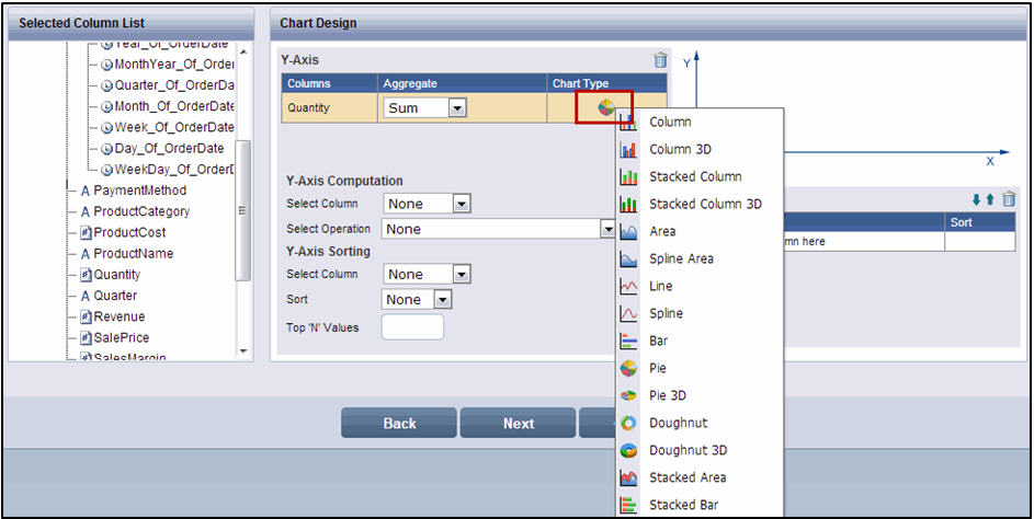
If needed, modify the chart type in the Chart Type section by clicking the chart icon and selecting another chart type from the drop-down list. Some of the characteristics of the chart widget design are changed if you change the chart type from a single series chart to a multiple series chart or vice versa. For more information, refer Design (Chart Type with One /Multiple data sets).
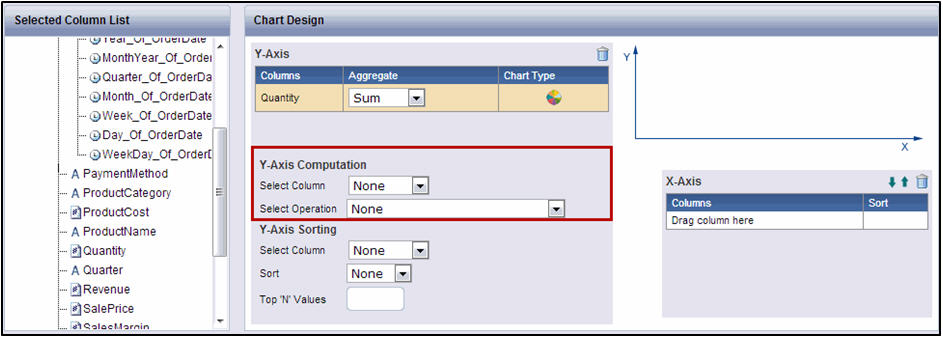
If needed, use the Y-Axis Computation subsection to perform computations on the Y-axis column and display the computed values in the chart instead of the aggregated values.
![]() Note:
Note:
To perform computations:
In the Y-Axis Options section, select the required column from the Select Column drop-down list.
From the Select Operation drop-down list, select the type of computation. The options available are:
Compute % of Total - computes each unique displayed value of the selected Y-Axis column as a percentage of the Grand Total value of that Y Axis column
Compute % of Row Total - for Charts types with a single data set, applying Compute % of Row Total is similar to applying Compute % of Total.
The Compute % of Row Total is applicable only when you use a column in the Series area of chart design. Only charts with one/ multiple data sets have a Series section in the chart Design page. Applying Compute % of Row Total treats every unique value of the Series column as a row and computes the value of the selected Y-Axis column for that row (unique series column value) as a percentage of the total of all displayed values for that row.
For example, if Revenue is the selected column for the Y-Axis computation, the X-Axis column is Product Category and the Series column is Geography, applying Compute % of Row Total treats each unique value of Geography as a row and display the percentage of Revenue for each Product Category as a percentage of the total for each of the Geography values. If we consider the unique Geography value as Europe, the computation displays the percentage of the total Europe revenue that was contributed by each of the product categories
Compute % of Column Total - for charts types with a single data set, Compute % of Column Total is not applicable as the computation of the selected Y-Axis column value for each unique value of the X-Axis is always 100%.
The Compute % of Column Total is applicable only when you use a column in the Series area of chart design. Only charts with one/ multiple data sets have a Series section in the chart Design page. Applying Compute % of Column Total treats every unique value of the X-Axis column as a column and computes the value of the selected Y-Axis column for each unique X-Axis column value as a percentage of the total of all displayed values for that unique X-Axis column value.
For example, if Revenue is the selected column for the Y-Axis computation, the X Axis column is Product Category and the Series column is Geography, applying compute % of Column total treats each unique value of Product Category as a column. It displays the percentage of revenue for each Geography as a percentage of the total for each of the Product Category values. If we consider the unique Product Category value as Laptop, the computation displays the percentage of the total Laptop revenue that was contributed by each of the Geographies.
Compute as a % of - selecting this option displays a section below it, where you can select a second column. It computes each unique displayed value of the selected Y-Axis column as a percentage of the value returned by the computation selected for the second column.
For example, if Sales Margin Amount is the selected column for the Y-Axis computation, the selected second column is Revenue, and the selected aggregation is Sum, the result of the Compute as a % of operation is the computation of Sales Margin as a percentage of Revenue.
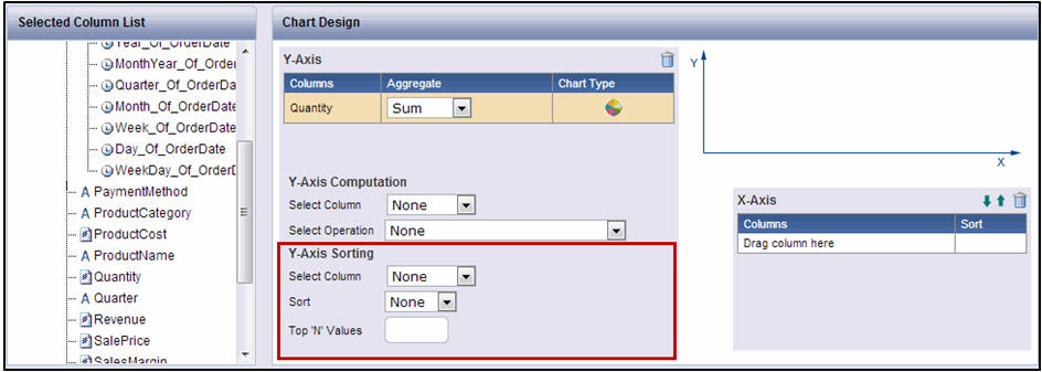
If needed, use the Y-Axis Sorting subsection to sort the display of the chart in ascending or descending order of the aggregated values of the Y-axis column
![]() Note:
Note:
To Sort:
From the Select Column drop-down list, select the required column
From the Sort drop-down list, select either ASC or DESC. ASC denotes Ascending. DESC denotes descending. The default option is None.
In the Top ’N’ Values text box, enter the value. You can choose to display only the top 5 or top 10 summary values in the chart by assigning the value of 5 or 10 in this textbox
From the Selected Column List section, drag the required column to the X-Axis subsection.
![]() Note:
Note:
You can add a maximum of six columns to the X-Axis. You can assign the column by which you want to understand the business metric as the X-axis. The chart visually illustrates the business metric (Y-axis) for each unique value of the column that you have chosen as the X-axis. For example, if the purpose of the widget is to understand Product Volume trends by Product Category, you can use the Quantity column (representing the business metric) as the Y-axis and use the Product Category column (representing the business parameter) as the X-axis
If needed, select either ASC or DESC from the Sort drop-down list. The default option is None.
![]() Note:
Note:
You can sort either the X-axis columns or the Y-axis columns. Sorting cannot be done on both the axes. If Y-axis sorting is applied and then you apply sorting on the X-axis, the Y-axis sorting is reset to None and vice versa.
For chart types with a single data set, the down arrow![]() and up arrow
and up arrow![]() are available only in the X-Axis subsection. These arrows are not available in the Y-Axis subsection because you can add only one column as the Y-Axis.
are available only in the X-Axis subsection. These arrows are not available in the Y-Axis subsection because you can add only one column as the Y-Axis.
For chart types with one/multiple data sets, the arrows are available in both the Y-Axis and X-Axis subsections
The down arrow ![]() in a subsection allows you to move a selected column down in the list. The up arrow
in a subsection allows you to move a selected column down in the list. The up arrow ![]() in a subsection allows you to move a selected column up.
in a subsection allows you to move a selected column up.
To delete a column from either the X-Axis or the Y-Axis subsection, select the column and click ![]()
You can add more than one column to the X-axis to provide the ability to drill down on the business parameter. For example, if the X-axis represents Geography and if in addition to understanding Revenue by Geography, you want to understand Revenue trends by Country within Geography, by State within a Country, and by City within a State, you can define the hierarchy by arranging the X-axis columns in the order that you need for the drill down. In this case, you can assign the Country column as the second level X-axis, the State column as the third level X-axis, and the City column as the fourth level X-axis.
You can click Preview to preview the design of the chart in a separate pop-up page. Closing the Preview pop-up page displays the design page
Click Next. The Properties page is displayed. For information on how to add details in the Properties page, refer Properties..
![]() Note:
Note:
Click Back to go to the Add Data Set(s) page (for chart types with single data set) or the Define/Add data Set page (for chart types with one/multiple data sets). Click Cancel to exit creation of widget
See Also:
![]()
<<Define Data Set | Properties>>