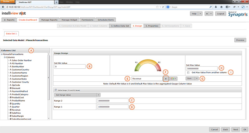
Let us consider an example where we wish to show if company revenue falls within the targeted range.
In the example below, the minimum value for the gauge is zero while the maximum is set to 500,000,000. (You may also set the maximum as a function of the column value, see explanation below). The Gauge is set to point to the ’Sum’ of the Revenue field. The screen for the Gauge chart design is different from the design screen for other charts and is explained below.
|
A |
List of columns available |
|
B |
Set the minimum of the Gauge here. Default is zero |
|
C |
R2 is the upper limit of the range within the Gauge |
|
D |
R1 is the lower limit of the range within the Gauge |
|
E |
The Gauge indicator will point to the computed value of this field. Drag and drop or choose from the column list and place in this field |
|
F |
Press + to choose from column list |
|
G |
Choose from Sum, Average, Min, Max, Count. This is the computation that will be applied to the column that is selected as the gauge indicator value. The Gauge indicator will point to the value of the computed field |
|
H |
Set maximum value of the Gauge. This area is used to manually input the maximum value as a fixed number (Constant) |
|
I |
If the check box (I) is checked, you can select another column from the column list at the left and use it to dynamically compute the maximum value instead of using a pre-defined constant max value for the Gauge
You could for example use the “Sales Target” column to determine Max value in order that your current actual sales will show against the Targeted Sales amount |
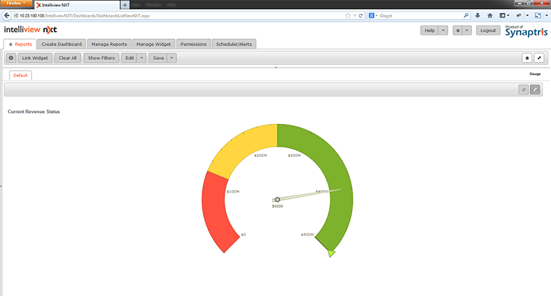
With above settings, you will obtain a Gauge chart like the one illustrated below:
![]()
<<Dual Y Axis Charts | Scheduler List>>