During the widget creation process, you can specify the widget type as chart. In addition, you can select a chart type that supports either a single data set or multiple data sets
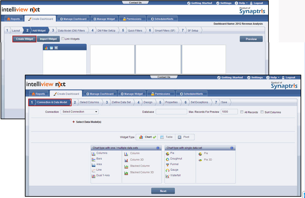
On the Add Widget page of the Create Dashboard menu, click Create Widget. The Connection & Data Model page is displayed.
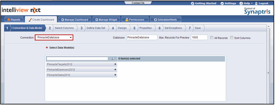
Connection & Data Model screen
From the connection drop-down list, select the connection. The database name is automatically populated in the Database text box and the data models are displayed in the Select Data Model(s) section
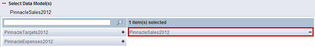
Select Data Model(s) - Connection & Data Model screen
If you need to increase the number of records retrieved from the database during widget design, do one of the following:
Modify the number of records in the Max. Records for Preview text box. The default number of records (1000) indicates that the first 1000 records returned by the data model are used during the widget creation process.
-Or-
Select the All Records check box
![]() Note:
Note:
During widget design, data is retrieved from the database for determining the columns available and for use in presenting a preview of the widget. The Max. Records for Preview text box and the All Records check box define the number of records that are retrieved during widget design
Selecting the All Records check box loads all records. This may delay widget design time. You cannot enter a value in the Max. Records for Preview text box if the All Records check box is selected. You must clear the check box to enter the value
Select the Sort Columns check box, if you want to list the columns in alphabetical order.
![]() Note:
Note:
The columns are displayed in the order they are returned from the database. Listing the columns in alphabetic order makes it easy for you to find the column you need from the column listing, even if you are not familiar with the database
In the Select Data Model(S) section, click ![]() next to the data model to select it. The selected data model appears on the right
next to the data model to select it. The selected data model appears on the right
![]() Note:
Note:
You can select only one data model while creating a chart type widget with a single data set. For chart types with one/multiple data sets, you can select a maximum of six data models
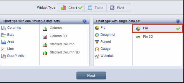
Click Chart as the widget type. Selection is denoted by a ![]() mark that appears next to Chart.
mark that appears next to Chart.
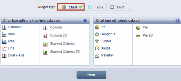
Select the chart type in the Chart type with one/multiple data sets or Chart type with single data set section
![]() Note:
Note:
The charts listed under Chart type with one/multiple data sets support the Series column in addition to the X and Y column. These charts support the use of a single data set or multiple data sets. Chart types to represent one or multiple data sets include column, bar, area, line, and dual Y-axis
The charts listed under Chart type with single data set support the use of the X and Y column but not the Series column. These charts support only one data set. Pie, Doughnut, Funnel, Gauge, and Waterfall are chart types that represent only a single data set
![]() Note:
Note:
Working with Multiple Data Sets
If you use only one data set in the chart widget design, the data set you use is mapped to one data model
If you use more than one data set in the chart design, each data set can be mapped as follows:
Each data set can be mapped to a different data model in order to have the widget reflect data from more than one data model. In this case,each unique data set represents a different data model.
For example, if you want to compare sales data retrieved from the Sales Transactions data model with sales target data retrieved from the Sales Targets data model, side by side in a chart; you can do so using the multiple data set functionality. You can map the first data set to the Sales Transactions data model, add the second data set, and map it to the Sales Targets data model.
Ideally, you must have at least one column that is common to both the data sets to present data in the chart in a meaningful way
Each data set can be mapped to the same data model and different filter criteria can be applied for the different data sets in order to have the widget reflect multiple sub sets of data from the same data model.
In this case, each unique data set represents a different sub set of data from the same data model
For example, if your data set has sales transaction data for multiple product categories and if you want to isolate only Smart phone sales data to compare it with Mp3 Player sales data and analyze if Smart Phone sales are affecting MP3 player sales, you can do so using the multiple data set functionality.
You can map the first data set to the sales transactions data model and filter it from smart phones. You can add the second data set, map it to the sales transactions data model again, and in this data set filter it for mp3 players
A combination of the above
Click Next. The Select Columns page is displayed
![]()
<<Chart Widget | Select Columns>>