In a Pivot table, data is summarized and presented as a crosstab. Summarized data is presented in a matrix like format where each row value corresponds to a unique value from the column used under the Row section while each column value corresponds to a unique values from the column under the Column section. The summarized data for the column used in the Data section for each of the unique row value and column value combination is presented at each of the intersection points of the data matrix.
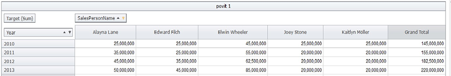
Below is an example of a pivot table. Each row corresponds to a value of year in the “Year” column. Each column corresponds to a salesperson in the ‘SalesPersonName’ column. The Target amount set for each year and salesperson combination forms the data matrix.
Below is an Illustrative example of a pivot table.
For each distinct value of ‘Year’ in the data set, values in ‘Targets’ have been summed up for every distinct name in the ‘Salesperson’ column from the same data set.
This is a simple pivot table, where the column headings are distinct values obtained from the values in only one column in the dataset. The same is true for the row headings. However, using Intelliview NXT you can obtain further sub-categorized “drill-down” perspectives too.
Additionally, you can use Intelliview NXT to generate pivot tables that enable you to present the maximum, the minimum, the average or the count of the values in the data column and to also perform computations.
Related Topics:
<<Creating Chart Widget with One/Multiple data sets - Save page | Create Pivot Widget - Connection and Data Model page>>