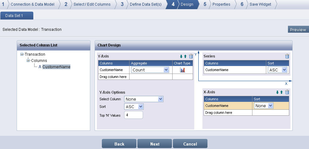
The Design screen displays with the defined Data Set(s), Selected Column List and Chart Design.
Design screen
Select a data set and drag and drop a column from the Selected Column List to X-Axis and Y-Axis columns respectively in Chart Design to create a simple chart.
Click the Chart Type icon to change to another chart type from the available list.
To create a drill-down chart, drag and drop two or more columns from the Selected Column List to the X-Axis columns Example:
Assume you have Product Category and Payment Method in X-Axis field and revenue in Y-Axis field. The initial chart displays Product Category Vs Revenue.
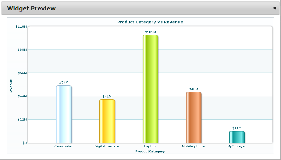
Product Category Vs revenue
Click on any Product Category data to drill down to the next level Product
Category Vs revenue > Payment Method. Use level up  to
move level up the drill-down chart.
to
move level up the drill-down chart.
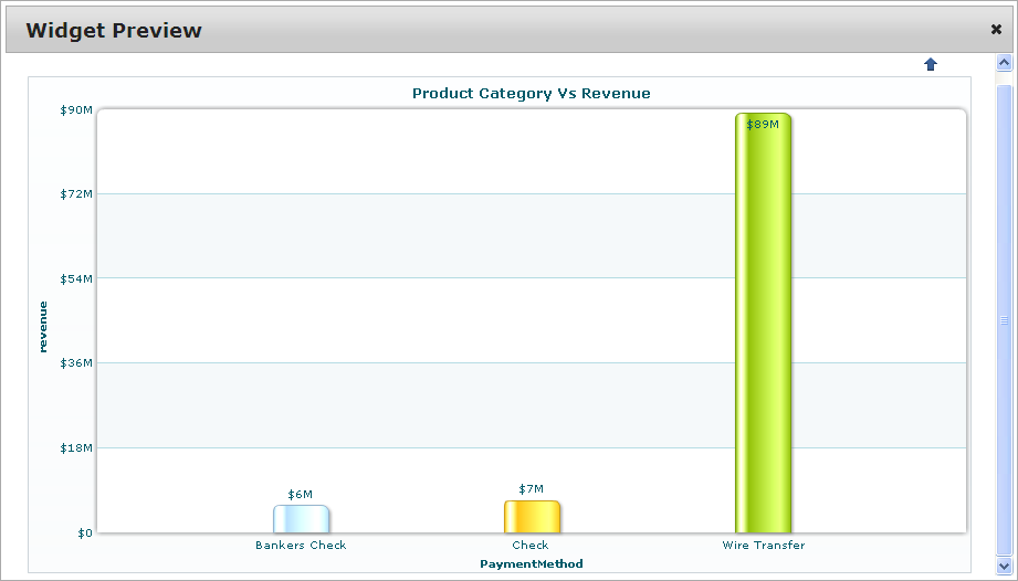
Product Category Vs revenue > Payment Method
To create a chart with series, drag and drop the required column from the Selected Column List in the Series columns. Example:
Assume you have Product Category in X-Axis, revenue and Payment Method in Y-Axis and region in Series. The Column chart displays the series Legend at the bottom of the chart.
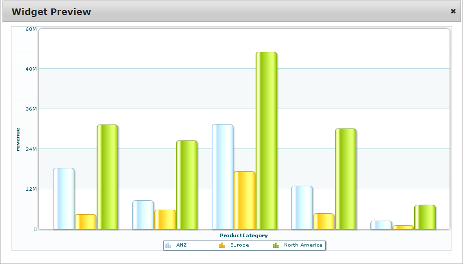
Chart with series
To create a Multi Series chart using two different data sets, refer Example for creating Multi Series Chart.
To move the fields to one level up or one level
down the X-Axis and Y-Axis, click level up-arrow  or level
down-arrow
or level
down-arrow  .
.
Select the sort order for the X-Axis column from the Sort list. To display Y-Axis Options, select the sort order as "None" for the X-Axis.
Select the aggregate function for the Y-Axis column from the Aggregate list. The default aggregate function is Sum for numeric fields and Count for non-numeric fields. The available functions are Sum, Average, Min, Max, Count and Count Distinct.
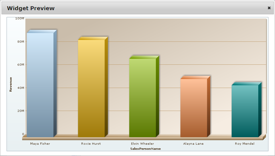
To display Top 'N' chart, use the Y-Axis Options: Select Column drop-down list, Sort list and Top 'N' Values. Example:
Assume you may want to show the top 5 Sales Person Name based on revenue. To do this, select the column you would like to use as the measure (for the above example it would be a Revenue) from the Select Column drop-down list, select whether you would like to show the columns in ascending or descending order from Sort list and enter the number that you would like to retrieve (i.e. 10 or 20, etc.) in Top 'N' Values. The Column 3D chart displays the Top '5' Sales Person Name sorted by descending order based on Revenue.
Click Trash  icon to remove the columns from X-Axis, Y-Axis or Series
columns.
icon to remove the columns from X-Axis, Y-Axis or Series
columns.
Click Preview to preview the chart.
Click Next to display the Properties screen.